
What is Responsive Design?
Responsive web design is an approach to web design. It refers to website creation that renders appropriately on any device with different screen size. Using this approach would scale the webpage, based on the device screen size, so the appearance on the user’s device looks good.
We, through this article, will be discussing the responsive design approach, its differences with adaptive design and its impacts on SEO. Check “SEO Services” to find out more about how you can improve your website’s ranking on Google.
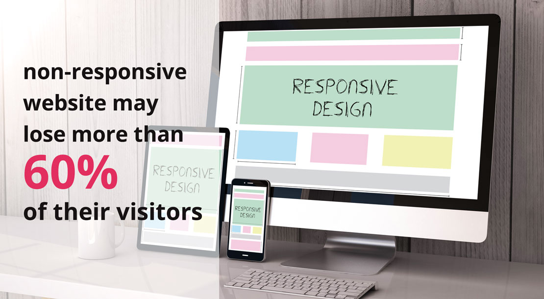
15 years ago, when smartphones and tablets were not available like today, responsive design was almost unknown. By increasing the number of people using smartphones and tablets, designing the websites in a responsive way became crucial. It is worth considering that based on multiple surveys, a website that is not responsive on mobile phones may lose more than 60% of their visitors.
Once the need for viewing a website on mobile phones increased, web design companies started to build a mobile version website in parallel with the desktop version. Going forward, they developed a special software by which, mobile users were able to have access to the website’s content. However, neither mobile version, nor special software could become popular, as users preferred to see the original website on their mobile phones.
Such demand from users’ side, paved the way for invention of responsive design. Therefore, when a user visits the website with a desktop or laptop, responsive design shows all the contents and details. Once the screen becomes smaller, the website automatically hides unnecessary parts, but important contents still remain on the small screen with a suitable appearance.
How Responsive Design prepares us for future changes
Responsive design would not only scale your website for any device in the market, but makes your website adjustable to any new screen size. Considering the possibility of developing new standards for screen dimensions, market participants should be ready to cope quickly and smoothly.
An important disadvantage that is associated with creating a software instead of responsive design, is the need for continuous software updates to synchronise it with the newer versions of the operating systems. However, by applying responsive design on your website, its appearance modifies itself automatically. In other words, a responsive designed website, adjusts itself to fit into any screen size, regardless of the operating systems.
Responsive Design advantages for SEO
Responsive design method would help the search engines to search out your website’s contents easier, that is good for your website SEO. Also, you don’t need to use duplicated contents for different mobile/desktop versions, that would be another benefit for your website SEO. For more information follow our Learn SEO Articles.
Since smartphones are becoming more popular all around the world, the manufacturers are bringing more innovation and newer technology such as production in different screen sizes. Consequently, appropriate display and appearance of your website on a visitor’s mobile screen, regardless of its size, will improve user experience. Moreover, considering new Google algorithms, the “Mobile Friendly Websites” are more likely to get a better rank on Google search results.
The facts described above, have convinced the web designers to consider the importance of responsive design as well as business owners to request for such web design approach.
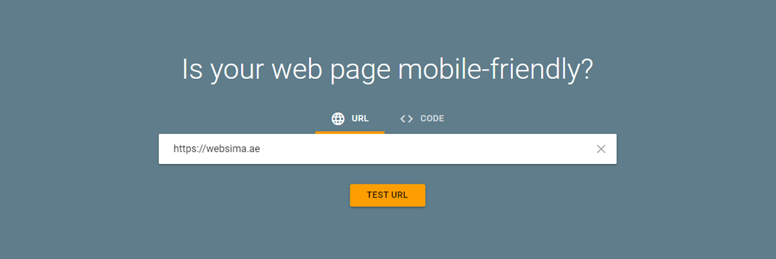
How does my website appear on different screens?
If you want to evaluate your website in terms of Responsive Design standards, you can go to the “Mobile Friendly Test” website and enter your domain URL to check it out.
It is important to notice that the time and money you spend on your SEO plan may be wasted, if your website is not mobile-responsive.
To sum it up, due to the rapid growth in usage of smartphones and tablets, mobile-responsive design is a crucial factor that must be considered by all market participants.
Responsive Design VS Mobile version
Surfing on the internet by smartphones requires data accessibility and fast loading pages.
In responsive web design, users don’t need to zoom in/out on a particular part of a website, as the website modifies itself to fit into their screen size. When a user is surfing on a mobile responsive website with a smartphone , the website automatically hides some unnecessary parts. As an example, when a visitor is using his smartphone vertically, it would be better to hide the slider bar and show the main contents only. Also, the font size should be larger, so users can read the texts easier.
By utilising Responsive Design method and applying correct CSS orders, your visitors will have a good experience of your website, no matter what device they are using. Moreover, you do not need to build a mobile version or a special software for your website.
Responsive Design VS Adaptive Design
Unlike responsive design, adaptive design doesn’t use a unique page structure for different dimensions. Instead, it uses different structures for different predictable dimensions to display on different screen sizes.
Generally, the web designer designs multiple versions of a website for desktop, tablet and mobile screens separately. When a user visits a website, the website automatically selects the page structure that would fit perfectly on that specific screen size. In adaptive design, instead of the screen size and percentage scaling, pixels and constant dimensions are used. This technique is incredibly efficient in “Company Web Design”.
In terms of Web Design Companies in Australia, “Adaptive Design” is an option to be used along with responsive design, as it’s becoming more popular among the people across the country. Although both techniques aim to optimise the mobile display of a website, they accomplish it in entirely different ways. To get the best result out of it, designers use them both together.
1- “Responsive Design” takes more time and effort
By choosing the responsive approach, you will have a more difficult task to accomplish. It is due to the fact that creating a unique structure and ensuring its perfect display on all different screen sizes, needs precise coding and complicated CSS orders. However, in adaptive design, you will simply create 3 or 4 structures for your website, so your website selects the best structure, based on the visitor’s screen size.
2- “Adaptive Design” provides less options
In an adaptive method, the designer creates 3 or 4 structures, so your website picks up the structure that is mostly aligned with the visitor’s screen size. However, due to the very competitive nature of the mobile market, different kinds of smartphones with totally new and different screen sizes are likely to come into the market in the future. In that case, the adaptive design will be worthless, if it doesn’t fit into the new screen sizes. On the contrary, responsive design displays perfectly on any dimensions, so it fits with any new screen size in the market with no need for new coding and structure.
3- “Responsive Design” Would Increase the Loading Speed
Once a user enters into an adaptive designed website, the website loads and investigates all structures, to find the best one that matches with the user’s screen size perfectly. While, in a responsive design approach, there is only one structure to load. Usually, the file style is heavier in a responsive approach while the loading time is longer in an adaptive approach. As a result, for websites with more pages, responsive design leads to a faster website while for websites with pages less than 20, adaptive design would be more efficient. In eCommerce websites, loading time becomes crucial as they have so many pages.
Which approach works better?
Both responsive and adaptive approaches have their own advantages and disadvantages, so there is no such thing as a better approach. Nowadays, the best approach is to combine both methods, to take advantage of all strengths and avoid all weaknesses.