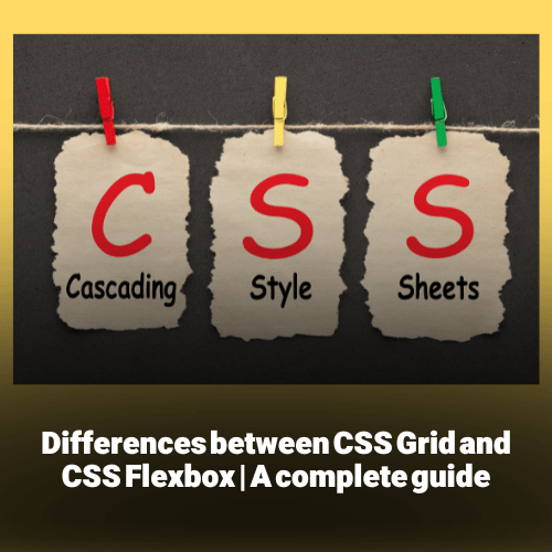
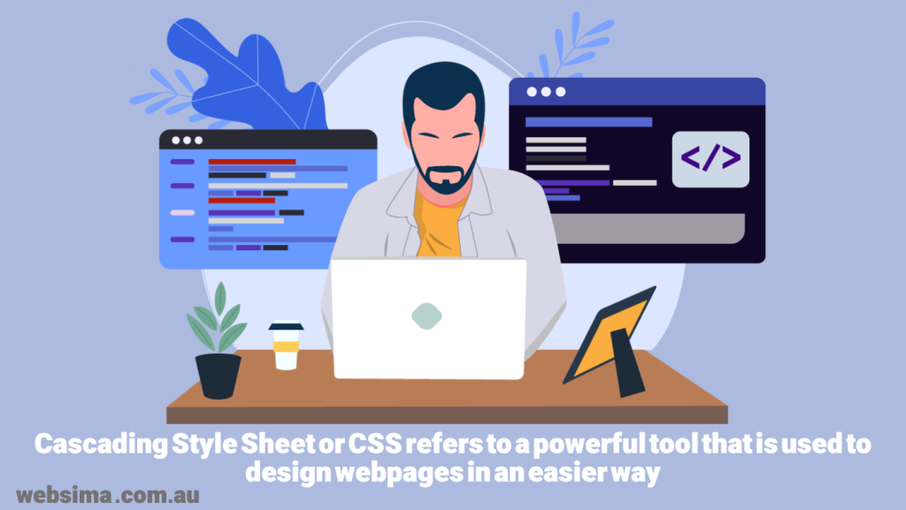
Cascading Style Sheet or CSS refers to a powerful tool that is used to design webpages in an easier way by designers. The tool provides a two dimensional grid based layout containing rows and columns, for the sake of making things easier for designers. By using CSS, designers are not needed to position the design elements manually, as they will be aligned into rows and columns. If you are thinking of building your own website, it is highly recommended to equip yourself with some web design knowledge, before looking for the best web design company in Australia. As such, read this article to the end to have a clear mind about the most important web design factors. Let’s start with CSS Grid and CSS Felxbox right now.
What is CSS Grid?
CSS grid is a two dimensional layout system that provides rows and columns. Using a CSS grid, makes designers capable of aligning different elements in their design into rows and columns.
The design elements in the grid system can be positioned in rows and columns. CSS grid is more useful for complicated designs.
What is CSS Flexbox?
Flexbox, like the Grid, makes designers capable of aligning the design elements in a webpage, however in a one dimensional order. In other words, the design elements can only be aligned in either horizontal or vertical order. Flexbox, as its name shows, is flexible. In other words, the box in Flex item, stretches automatically for the content to fit in.
What are the differences between CSS Grid and Flexbox?
Web design Australia price, if it comes from a reputable firm, is relatively high. Hence, you must fully understand your requirements such as the differences between Grid and Flexbox, to avoid rework and redesign.
-
Grid provides two dimensional layout while Flexbox allows for one dimensional layout
Flexbox offers to align elements in one dimension only. It must be either vertical or horizontal. In contrast, Grid makes designers capable of arranging the elements in both vertical and horizontal on the same webpage. As an example, if you are a SEO agency in Dubai and intending to put a design element on your website for your different SEO packages in Australia, it is recommended to use Grid system rather than Flexbox, to be able to use both vertical and horizontal option at the same time.
-
Flexbox is more flexible in space distribution, while Grid is not
Flexbox, either arranged vertically or horizontally, stretches in and out based on the content size, which gives more flexibility to the designers to not be worried about the size of the content. This will not be an option for the Grid system.
-
Item management
Flexbox makes designers able to change the size and position of the elements as well as their order. In other words the flexbox gives the designer more flexibility on managing the items. The Grid system is good for designing more structured and organized designs and creating hierarchical structure. It allows designers to create a numerical order for all elements, when it comes to item management.
CSS Flexbox best cases to use
CSS Flexbox is best for projects smaller in scale such as design for a corporate website. In such a project, where a few rows or columns are needed, Felxbox is ideal.
Besides, Flexbox is perfect to use in projects where the designer needs to align elements. Flexbox makes the element alignment quite easy.
Finally, Flexbox is an appropriate layout system for content first design approach. In particular, if the designer is not fully aware about how the content will look like, Flexbox would help a lot by manipulating the sizes and positions.
CSS Grid best cases to use
Grid layout system is appropriate in projects, where the designer needs a complex design. The two dimensional layout makes designers capable of getting the complex designs done. For instance, if you are planning for your ecommerce web development in Australia, the Grid system would be perfect.
The grid system, in contrast with the Flexbox, is good for layout-first design, where the designer has the layout structure in hand.
The Grid system is also appropriate in projects where element overlapping is required. The two dimensional system makes it easy to create overlapping elements.
Finally, the Grid layout system makes it easy to define the gap between rows and columns, which is not an option in the Flexbox layout system.
CSS Grid and Flexbox summary
It doesn’t matter whether you want to do a simple task like registering your website on Google, or a complicated task like web home page design for your mega ecommerce store, the design and the design tools that are chosen to utilize, play an important role on how your website looks.
CSS Grid and CSS Flexbox are powerful layout systems that make life easier for designers by providing very useful design tools. Both layout systems have their own advantages and benefits. However, it is very crucial to choose the right one based on the type, size and nature of the design project.
As such, it is highly recommended to work with a professional and well-experienced web design company to rest assured of the quality of your web design.
Websima, with more than a decade of local and international experience and a proven track record of success is more than happy to help, if you are in need.
Feel free to contact us and book for your free consultation meeting to discuss your project further. We are fully committed to provide the best solution for our clients at our earlier possible.

